Mar 21, 2025
Material Properties Explained: A Beginner's Guide to PBR Workflows
Guide
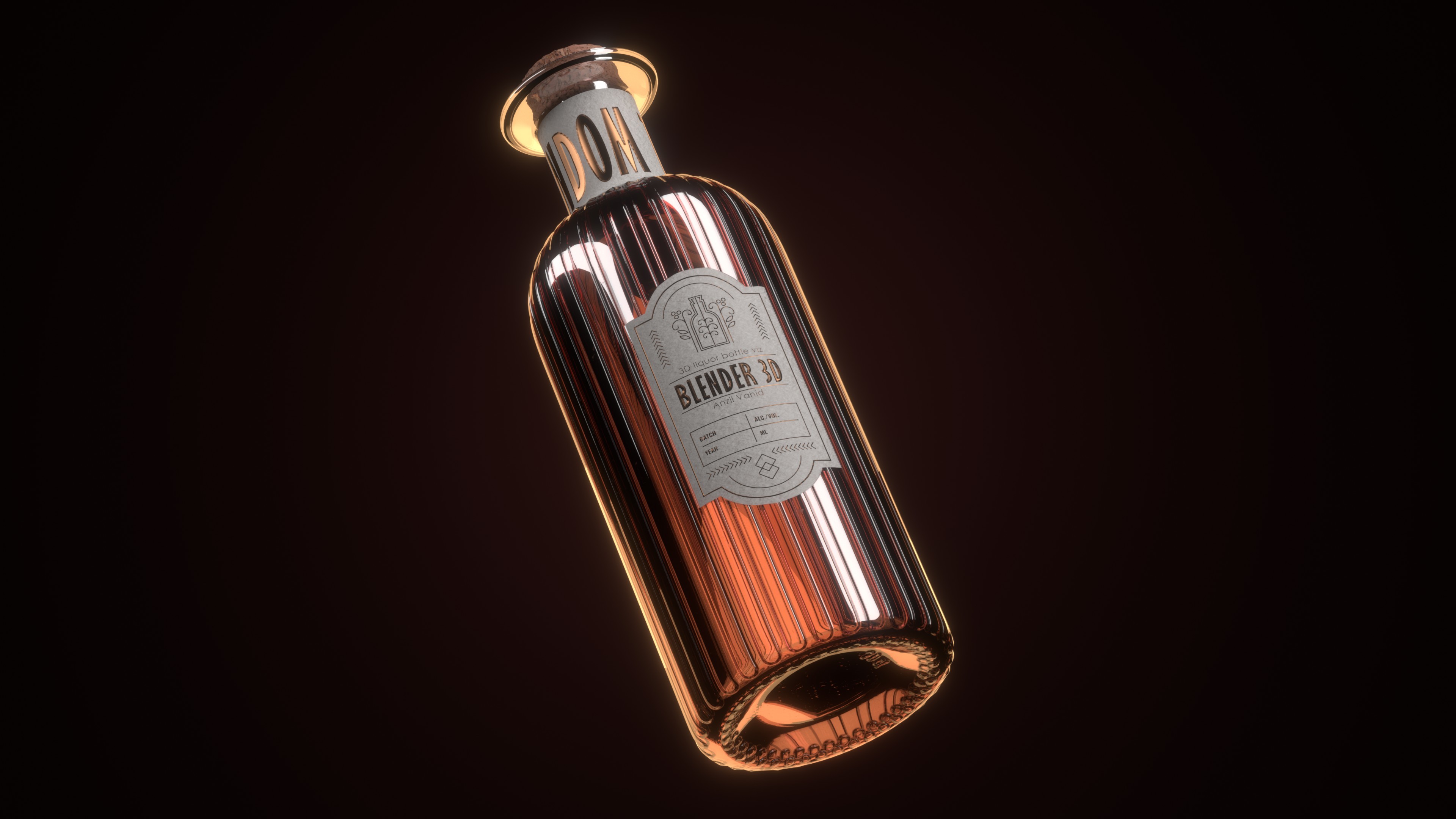
Physically Based Rendering (PBR) has revolutionized 3D graphics by providing a standardized approach to creating realistic materials. In Blender, the Principled BSDF shader encapsulates this approach, offering a comprehensive set of parameters that simulate how materials interact with light in the real world. This guide breaks down these material properties in simple terms, helping you understand what each parameter does and how to use it effectively.
What is PBR?
Physically Based Rendering is a method of shading and rendering that provides a more accurate representation of how light interacts with surfaces. Unlike older approaches that used arbitrary values, PBR is based on actual physical properties of materials, making it easier to create consistently realistic results across different lighting conditions.
The key benefits of PBR include:
Consistency: Materials look correct under any lighting scenario
Reusability: Well-made PBR materials work in multiple projects
Predictability: Artists can work with familiar real-world properties
Efficiency: The standardized approach makes material creation more intuitive
Understanding the Principled BSDF
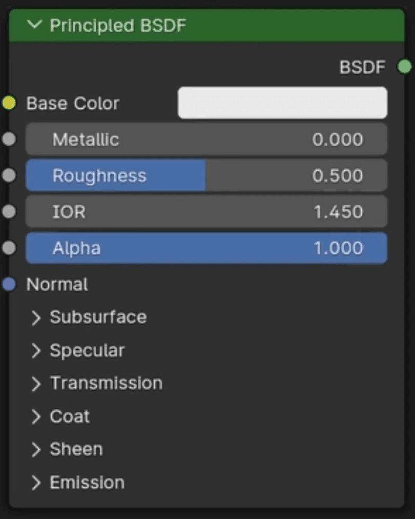
Blender's Principled BSDF shader is the cornerstone of PBR workflows in the software. Let's break down its most important parameters:
Base Color
What it controls: The diffuse color of the surface – essentially what color the object appears to be.
Real-world equivalent: The pigment or dye in a material.
Best practices:
Keep base colors in a believable range (avoid pure black or saturated colors)
For metals, base color should be very dark or the color of the metal itself
For non-metals, base color represents the actual color you see
Common values:
Wood: Brown tones (RGB ~0.5, 0.25, 0.1)
Skin: Various tones (RGB ~0.8, 0.6, 0.5)
Plastic: Any color, but slightly desaturated
Concrete: Neutral gray (RGB ~0.5, 0.5, 0.5)
Metallic
What it controls: Determines whether the material behaves like a metal or a non-metal (dielectric).
Real-world equivalent: The electronic configuration of the material that defines how it conducts electricity and reflects light.
Best practices:
Use binary values (0 or 1) for most materials
0 for non-metals (plastic, wood, skin)
1 for metals (steel, gold, aluminum)
Intermediate values (0.3-0.7) only for special cases like dirty or oxidized metals
Technical note: Metals absorb all refracted light and convert it to heat, which is why they have no subsurface scattering and their reflections take on the color of the base color.
Roughness
What it controls: How smooth or rough a surface appears, affecting how light scatters when reflected.
Real-world equivalent: The microscopic imperfections on a surface.
Best practices:
No real-world surface has a roughness of exactly 0 or 1
Most materials fall between 0.1 and 0.8
Roughness affects the sharpness of reflections
Consider surface treatment (polishing, wear, etc.)
Common values:
Polished metal: 0.1-0.2
Clean plastic: 0.2-0.4
Finished wood: 0.4-0.6
Concrete: 0.7-0.9
Specular
What it controls: The intensity of reflections on non-metallic surfaces.
Real-world equivalent: The index of refraction (IOR) that determines what percentage of light reflects off a surface.
Best practices:
For most non-metals, keep between 0.3-0.5 (default 0.5 is ~IOR 1.5)
Increase for materials like wet surfaces or glass (0.5-1.0)
Has minimal effect on metals (metallic = 1)
Technical note: Specular reflection is the mirror-like reflection of light, as opposed to diffuse reflection where light is scattered in all directions.
IOR (Index of Refraction)
What it controls: How light bends when passing through transparent materials.
Real-world equivalent: The physical property that determines how much light slows down and changes direction when entering a material.
Common values:
Air: 1.0
Water: 1.33
Glass: 1.5-1.7
Diamond: 2.417
Best practices:
Only relevant for transparent materials
Higher values create stronger reflections at glancing angles
Works in conjunction with transmission settings
Transmission
What it controls: How much light passes through the material.
Real-world equivalent: Transparency or translucency of a material.
Best practices:
0 for opaque materials
1 for completely transparent materials
Use with IOR for accurate glass, water, etc.
The Transmission setting affects both direct light and background visibility
Subsurface Scattering
What it controls: How light penetrates and scatters within a material before exiting.
Real-world equivalent: The phenomenon where light enters a material, bounces around inside, and exits at a different point, creating a soft, diffused look.
Best practices:
Essential for organic materials (skin, wax, food)
The Subsurface Radius controls how far light travels within the material
Set different radius values per color channel for more realistic results
For skin, slightly higher radius in red channel and lower in blue
Sheen
What it controls: Soft, velvet-like reflection at grazing angles.
Real-world equivalent: The fuzzy surface of fabrics like velvet, cloth, or microfiber.
Best practices:
Use for fabrics, especially those with small fibers
Often combined with some roughness
Sheen Tint can add subtle color variations to the sheen effect
Clearcoat
What it controls: An additional layer of reflective coating on top of the base material.
Real-world equivalent: Varnish on wood, clear coat on car paint, or glazing on ceramics.
Best practices:
Use values between 0.3-1.0 depending on coating thickness
Adjust Clearcoat Roughness independently for worn or textured coatings
Particularly useful for automotive paints and lacquered surfaces
Emission
What it controls: Light emitted by the material itself.
Real-world equivalent: Self-illuminating materials like neon, LED, or glowing objects.
Best practices:
Use emissive materials as light sources (enable in Material settings)
Color determines the hue of the emitted light
Strength controls intensity (can go well above 1.0)
Best combined with an actual light for realistic scene illumination
Procedural matrials can be tweaked at any point during the workflow
Texture Maps in PBR Workflows
While understanding the individual parameters is crucial, most professional PBR workflows utilize texture maps to control these parameters across a model's surface. Here are the essential PBR texture maps:
Base Color Map
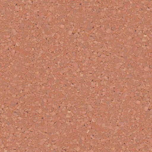
Controls the diffuse color of the surface
Should not contain lighting information or shadows
Represents the clean, unlit appearance of the material
Metallic Map (Grayscale)
White areas (1.0) are metallic
Black areas (0.0) are non-metallic
Sometimes combined with Roughness in what's called a "Metallic-Roughness" map
Roughness Map (Grayscale)
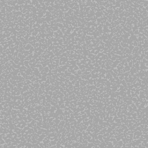
Controls microscopic surface variation
White areas (1.0) are completely rough
Black areas (0.0) are completely smooth
Details like fingerprints, scratches, or surface wear go here
Normal Map
Adds surface detail without additional geometry
RGB image storing directional information
Creates the illusion of bumps, crevices, and surface irregularities
Blue-purple appearance is characteristic of tangent-space normal maps
Ambient Occlusion Map (Grayscale)
Represents how exposed each point is to ambient lighting
Darkens crevices and areas with less light exposure
Often multiplied with the Base Color map
Height/Displacement Map (Grayscale)
Used to actually displace geometry (unlike Normal maps)
Requires sufficient mesh subdivision
Black is lowest, white is highest
Provides actual geometric detail rather than just the appearance of it
Setting Up a Basic PBR Material in Blender
Let's walk through creating a simple PBR material from scratch:
Start with a new material: Add a new material to your object and make sure you're using the Principled BSDF shader.
Establish base parameters: Decide if your material is metallic or non-metallic first, as this affects how you'll approach other parameters.
Add texture maps: Connect your texture maps to the appropriate inputs, using Mapping and Texture Coordinate nodes as needed for proper UV mapping.
Fine-tune settings: Adjust parameters that aren't controlled by texture maps, like Subsurface Scattering for organic materials or Clearcoat for glossy finishes.
Test under different lighting: The true test of a PBR material is how it looks under varying lighting conditions. Use an HDRI environment or multiple light setups to verify consistent appearance.
Common PBR Material Examples
Brushed Metal
Base Color: Metal color (e.g., steel: RGB ~0.8, 0.8, 0.8)
Metallic: 1.0
Roughness: 0.3-0.5 with directional brushed texture
Normal Map: Subtle striations in brush direction
Plastic
Base Color: Any (slightly desaturated)
Metallic: 0.0
Roughness: 0.2-0.4
Specular: 0.5
Clearcoat: 0.3 (for glossy plastic)
Human Skin
Base Color: Skin tone texture (avoid pure reds)
Metallic: 0.0
Roughness: Varying map (0.6-0.9)
Subsurface: 0.2-0.3
Subsurface Radius: (0.5, 0.3, 0.2) for RGB
Specular: 0.35
Polished Wood
Base Color: Wood texture
Metallic: 0.0
Roughness: 0.4-0.6
Specular: 0.5
Clearcoat: 0.5-0.8
Clearcoat Roughness: 0.2-0.3
Conclusion
Understanding PBR material properties is fundamental to creating convincing 3D assets in Blender. By learning the physical basis for each parameter and how they interact, you can move beyond trial-and-error material creation to a systematic approach that produces predictable, realistic results.
Remember that observation is your best teacher – study reference images of real materials, noting how they react to light from different angles. With practice, you'll develop an intuitive sense for which parameters to adjust to achieve specific material qualities.
The Principled BSDF shader in Blender provides an excellent all-in-one solution for PBR workflows, allowing you to create virtually any material from everyday plastics to complex surfaces like car paint or human skin. Master these principles, and you'll elevate your 3D work to new levels of realism and consistency.